


Unless offers four types of overlay components: popups, sideboxes, bars, and popovers.
You can use these components to announce the latest features in your product, onboard new users, activate existing customers with nudges, promote forms and surveys, and much more.
You can preview the different overlay components before choosing the one you would like to use. Keep in mind that the visual aspects and functionality are both customizable so focus on the type first. Once edited, your final overlay will be something unique to your business and website.
Overlay component types
Popup: As the name suggests, popups appear as an additional layer on top of your page, focusing your users' attention on a single message. Often, they reach conversion rates 2-3 times higher than the website's average. When triggered on exit intent they are a great way to convert visitors who are about to leave. You can use a popup to show personalized discounts, capture leads by offering content upgrades, offer a product demo, reduce shopping cart abandonment, and so much more.
Sidebox: With a sidebox you can capture your visitors’ attention without interrupting their browsing experience. They are ideal for showcasing related content and to create targeted offers. You can use a sidebox for self-segmentation, to recommend content, make announcements, promote events and webinars, etc.
Bar: With bars you can create non-intrusive header or footer bars that stay visible as visitors scroll through your website. They are a great way to guide your visitors through the conversion funnel and to focus their attention. You can use a bar to welcome visitors, capture email addresses, highlight important information, update customers about new features, grow your social following, and more.
Popover: Popovers are similar to popups with the difference being that they are attached to a certain element on the page which you can define simply by pointing and clicking. It's great if you want to bring attention to a certain point in your product dashboard, highlight a new feature, emphasize an action you want users to take, etc.
How to set up an overlay component
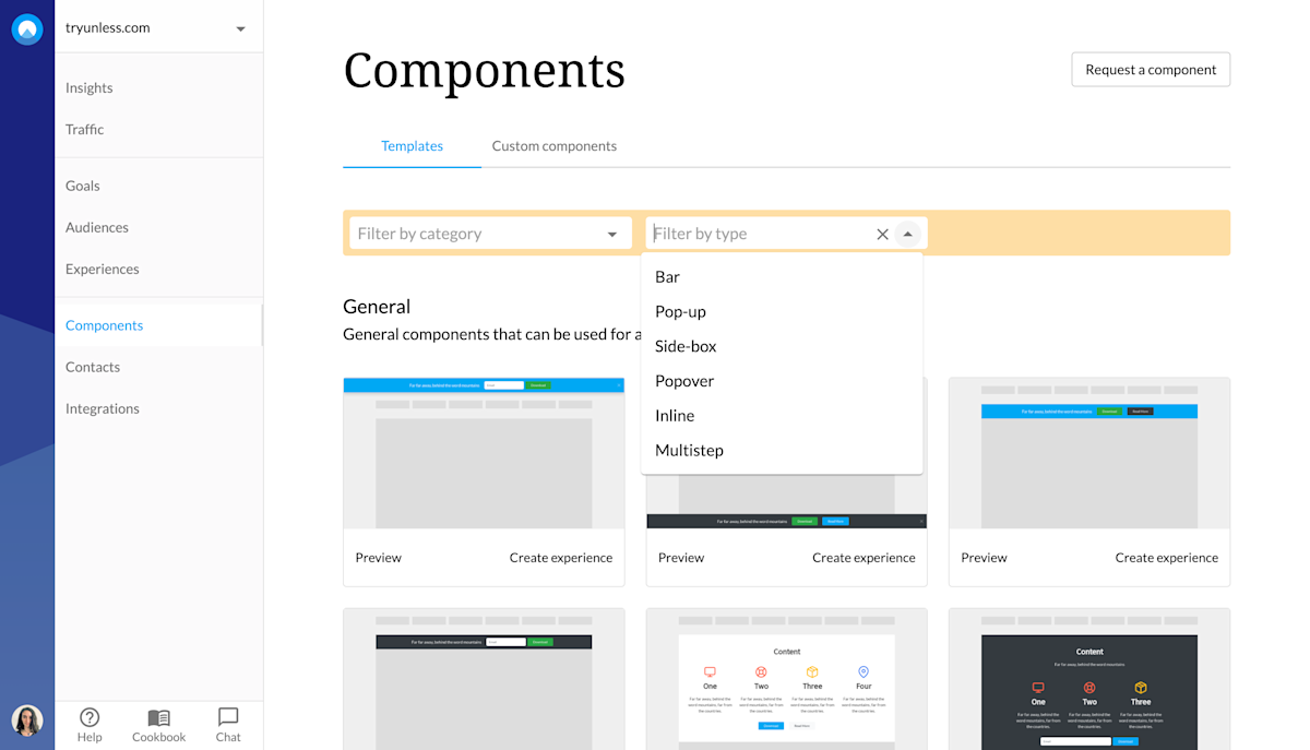
First step is to choose a component. Via the Components tab, you can view the complete library of components that are ready out of the box. You can use the filters to view all popups, bars, sideboxes, etc. at once or also filter by categories such as onboarding, activation, forms, and more depending on your needs.

You can preview the different components before choosing the one you want to use. Once you've made your choice, click Create to get started.
Overlay component settings
This will take you to the Settings tab. You might notice that the settings for a component are very similar to on-site experiences. You give your component a name, define the page(s) it should appear on as well as the audience(s) that should see it.
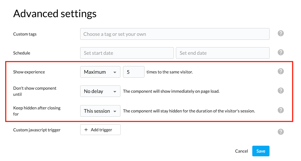
There are also some advanced settings here to keep in mind. For example, it is possible to show your experience to a visitor an unlimited amount of times or to set a maximum number.
Additionally, when it comes to an overlay component, you can define when the overlay is shown (no delay, time on page, scroll distance, or exit intent) and how long it remains hidden after a visitor interacted with it (ie closed the overlay or clicked the CTA button).
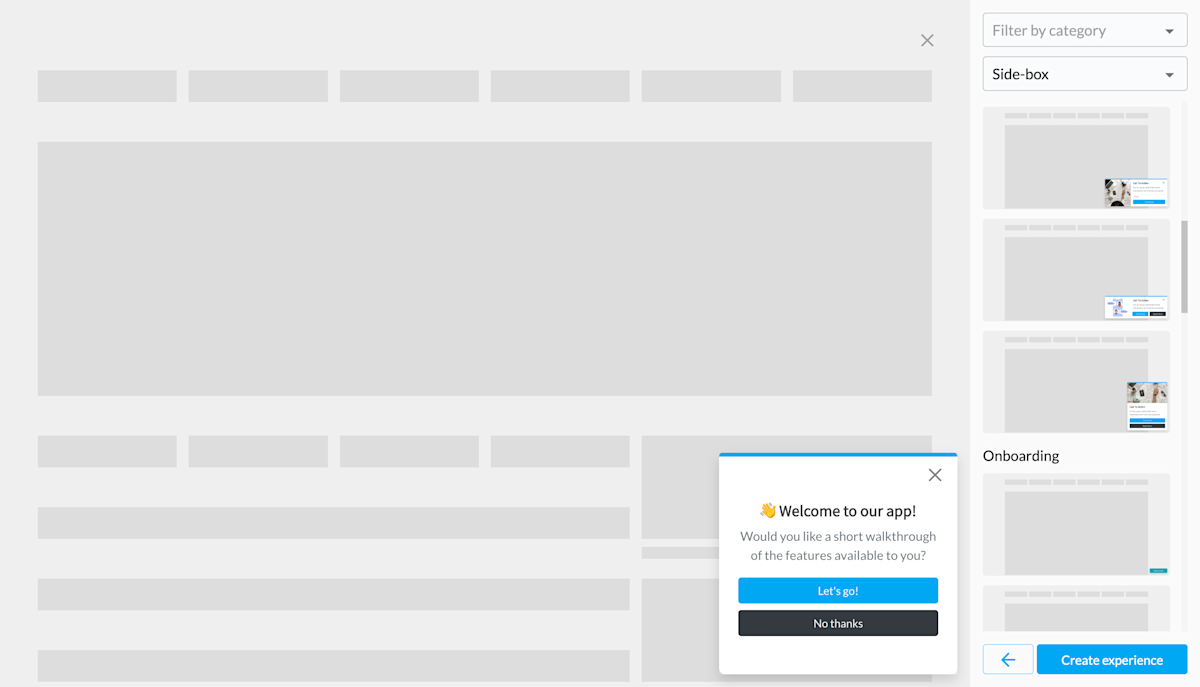
Once you are ready, first click Save and then click Open experience editor. Once your selected overlay has loaded within the editor, as in the example below, you can click Configure component.
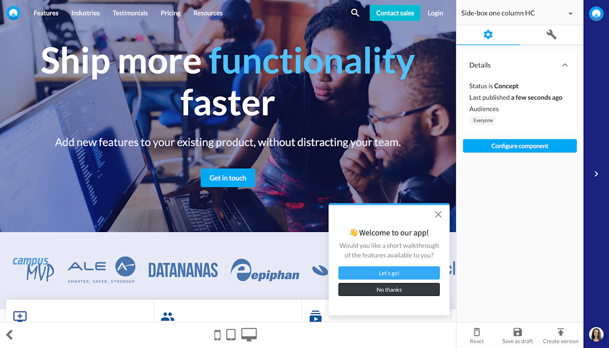
Overlay component design
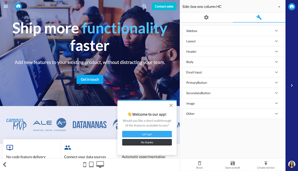
Once here, you can start configuring your overlay to make it fit your particular use case. To begin with, you decide on the positioning of the component and the image. Then you can adjust the text as well as fonts, colors, etc. (if you want to steer away from your preset theme).
Lastly, establish whether there should be an email collector and if you want to have a CTA button or two, what the buttons should say and where they should take a visitor to and so on. If you need further customization, you can also use the Other section to add custom CSS and Javascript and to switch on Expert mode.
Once you've made all the changes you need and your overlay is ready, make sure to save, create new version and publish before exiting the editor. Then click start experience at the Settings tab for this component which we've seen earlier.
Ps. If you haven't already defined your themes to match your company branding, you can do that via the Themes tab under account settings. This is something you (or a designer from the team) has to do once and then your theme(s) can be applied to all your components.